September 5th, 2007
Partfaliaz interview Fiodor Sumkin
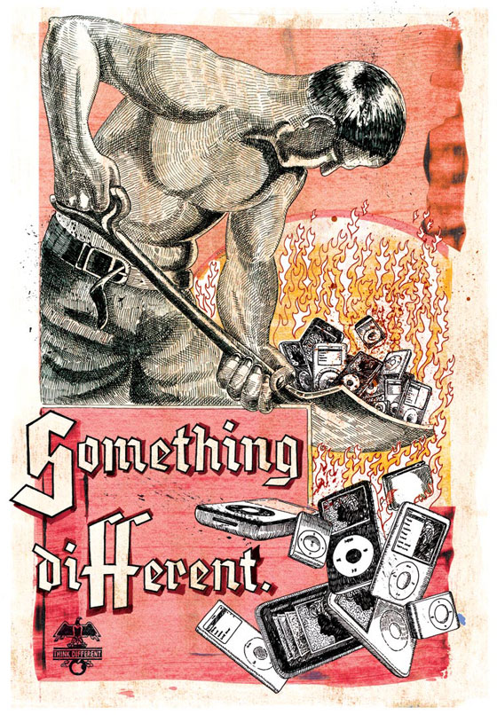
Bielorussian Fiodor Sumkin, living in Amsterdam, is actually illustrator and type drawer, producing awesome hand-drawn artworks, faithfully oldschool and with quite an interesting personality.
At 19 you were AD for a famous magazine in Moscow and at 21 you created your own agency, then you were AD again in Italy and finally are illustrator in Amsterdam. I guess you had some passion and determination, but what made you decide to get in graphic design ? How did you take this way ?
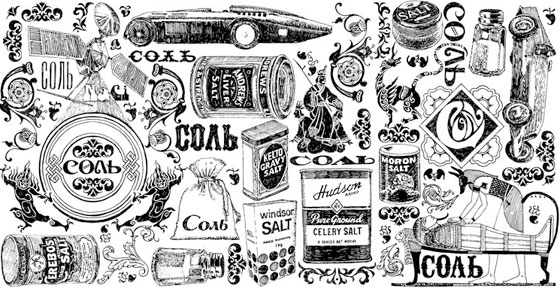
I was born in the Soviet Union, and at “visual” point of view my childhood was very monotonous and boring-dull: everybody were was wearing the same clothes and all cars were looking like tanks… In general, everything around me was gray or black and white… The first time I’ve seen a Mercedes was when I was 12. It was in 1990, the great time of Perestroika had come to our small provincial town. We made some nice exchange of our valuables… We changed Cosmos and Yuri Gagarin, Olympic Mishka and Matreshka to Americans cigarettes, Mc’Do and beer in tin cans. Sure, now I understand that it was not an pretty equal exchange… (Ask any teenager what he prefers more — a lecture about Lenin, or Sneackers and a Sony Play-Station.) At that time, the imported overseas cigarette packages and bear cans seemed to be a miracle for me. Together with my school friends we were collecting whole collections of different boxes and cans. I had the largest collection of cigarette packages, because my house was near a hotel for foreigners, so every evening I was rummaging the rubbish. However a few years later my parents had started to go to Poland and brought some fashion magazines from … in my point of view from another planet.
At the age of 19 I won a tender for a magazine design and they suggested me a position of art-director. Probably it happened thanks to cigarettes packages and beer cans. By the way on that time I already had an experience in graphical software because at the age of 16, I left a school for working in a small design studio.
Thus, Mr. Gorbachev, Perestroika, and the Berlin Wall were closely interlinked with the graphic design in my life.
Why “opera 78” ?
Opera is an Italian word for “work” meaning “artwork” – un’opera d’arte for example – while “78” is simply because I was born in 1978.
Your work is powerful and very personal but still universal, do you feel like mixing cultures in your art ?
Yes, but… in fact, I have not yet created something really worthy… When I was working in Moscow I was very inspired by Dutch and American design. I had more interest in adopting the foreign culture than mine (we always want something that we do not have).
Now, after many years of living in Europe I would like to study better the history and culture of my own country. Only after that it will possible to combine different styles, adapt forgotten things and give them a new shape… I mean, to create something really great you have to know the subject.
What inspires you ? Do you have influences ?
My influences are absolutely everything from the late 60’s to early 70’s: art, music, movies… When I watch old movies, first of all I like actors… they have more human, a bit naive faces. I do not see this nowadays. The same for music or magazines, everywhere. Now everybody uses computers because this is faster and easier … but everything becomes flat, fake, and insincere.
For example, I’m not sure if the latest issues of fashion magazines looks as revolutionary as Avant-Garde magazine or Playboy of late 60’s.
Considering all the advantages of digital photography, it doesn’t have so much life as the black and white film photos.
So everything real and natural inspires me more… precisely, the understanding of how little of vivid things is remaining in our life.
Is your art a reflect of your way of life ? How would you define it ?
Of course. Art is the meaning of my life. It does not matter what exactly I am doing – graphical design, painting or commissioned illustration. The main thing for artist in my opinion is heart. Probably this is the reason why many people are poor and have difficulties to live. I personally believe not everyone is born for working in the office or even for selling their own posters and shirts in order to survive. In this profession, luck plays a big role. No one can guarantee that your talent will be appreciate and rewarded.
Your paintings are collected around the world, do you also have exhibitions ?
When I was living in Italy, I often made exhibitions… But now I create more illustrations than paintings… so the exhibitions are different. By most part these are collective expositions in different arts galleries where they sell posters and shirts. It would be so interesting to see those paintings I made 3 or 4 years ago. Those were original things… a kind of web-design on canvas. Probably I will take up paints ones again. I still have two boxes of oil and acrylic ink .
What project are you working on actually ?
I’m currently working on project called EcoPera. After my last visit to Paris, this June, I decided to stop spending all my free time on creation of self-promotion illustrations only. Now I want to find some nice way in which I can be more useful for the society. Since I know a lot of people who work for non-profit organizations focused on solving ecological problems or protecting wildlife, why not trying to combine art and ecology?
EcoPera is dedicated to the global water crisis and the ecology in general… I am planning to prepare series of 30 illustrations and I hope it will be something particular, i.e. not like typical social ad’s paid by government. Moreover, it is a permanent project — I work on it when I have free time… Probably I’ll make an exhibition in the nearest future, who knows…
What is new in your clients demands, and to your point of view, what trend do you see emerging ?
I get more orders for calligraphy, type compositions and typography in general. I’m finally starting to study Font Lab in order to make my own fonts. If last year I had only one font under development, this year I have fifteen. Unfortunately I could not find time to digitalising all characters, probably I find the time this autumn….
Actually, I like to draw the fonts by hand… In general, I use “old school style” everywhere where it is possible. Picasso once said. “Computers are useless. They can only give you answers.” A lot of my new clients agree with that. … for example, I’m currently working with Parisian short-film producers mr. Hyde, Dutch Agency “Unit”, airlines Aeroflot, Esquire Magazine, Rolling Stone… they are ordering hand-drawn typography only.
Fiodor is represented by Unit-CMA
Favorite movies:
il Portiere di notte (1974, Liliana Cavani)
Turks fruit (1973, Paul Verhoeven)
il Conformista (1970, Bernardo Bertolucci),
Quiet Days in Clichy, (1970, Jens Jørgen Thorsen)
music:
Bob Dylan, The Doors, Deep Purple, Smokie, Bee Gees.
design:
Beatles’ movie Yellow Submarine (1968, George Dunning),
Citroën DS, 1960’s telephone Ericofon (Cobra), JVC videosphere television.
places:
Paris: Colette, Palais de Tokyo, Pompidou Centre
Amsterdam: Stedelijk Museum, New Zeeburg area…
Milan: Navigli and Brera Area
Rome: Porte Portese, Lungotevere, cafe Doppio Zeroo
design books:
“Summer of Love: Arto of the Psychedelic Era”, Tate Publishing, 2005.
House Industries, Die Gestalten Verlag, 2004,
Type One, Die Gestalten Verlag, 2004,
Büro Destruct II, Die Gestalten Verlag, 2003,
Los Logos, Die Gestalten Verlag, 2002,
“Signwork: a craftsman’s manual”, Bill Steward, 1984.
And also
“The Elements of Typographic Style”, Robert Bringhurst, (Russian edition with endnotes by Vladimir Efimov) 2006,
“Book of Letters From ?? to ??.” Yuri Gordon, 2006.
© All images by courtesy of Fiodor Sumkin
Comments are closed.

